
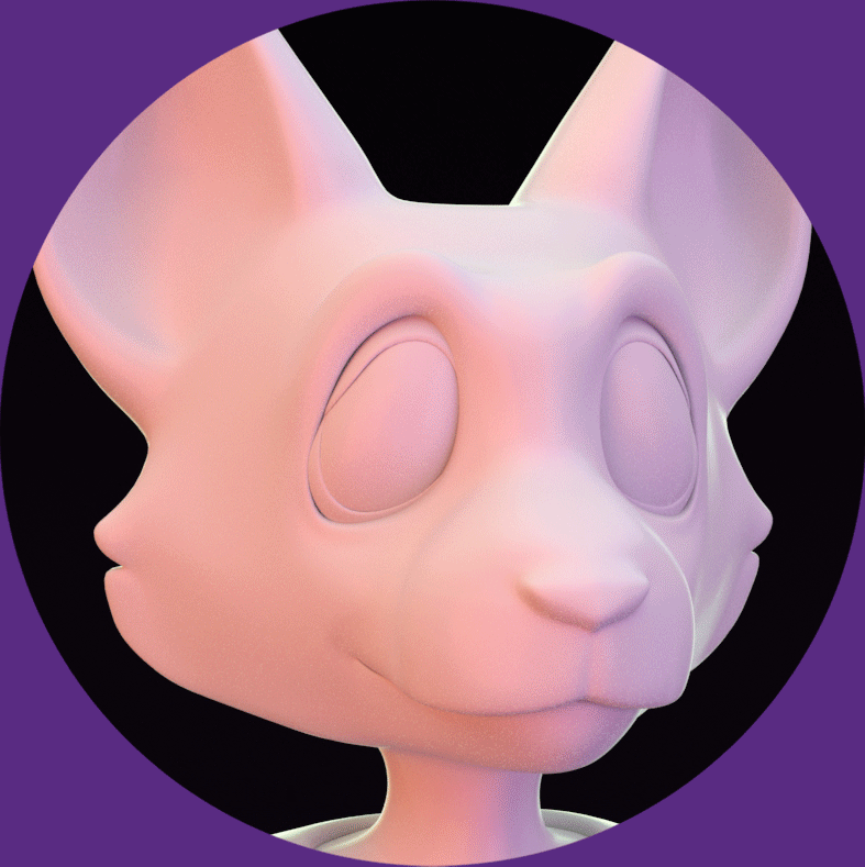
Lane Collie
Kreeture of Habit
Multimedia Artist
About...

The Artist
Kreeture
The Brand
About
The Artist

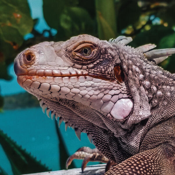
Hello! I'm Lane.
My first and truest love is storytelling, and it was this passion that led me to pursue a career in art. I'm always looking for new stories to tell and new ways to tell them. My friends and family would describe me as a perfectionist, as I'm always focused on the details and how small things come together to create the bigger picture.I'm a first-generation college graduate and have always been a very studious person. One of the driving factors in my life is the pursuit of knowledge, as I love learning new things and gaining new skills. In fact, I attended college twice and earned two bachelor's degrees. I always tell myself, "If I don't already know how to do something, I can always learn."Of course, I'm not all business. When I'm not working on a portfolio piece, you can find me listening to podcasts, watching films and documentaries, cooking, drawing in Procreate, or doing some sort of DIY project. I'm also one of those weird people that really enjoy mundane things like doing laundry and going grocery shopping. My dream is to one day have a huge backyard garden where I grow all my own fruits and vegetables. I aspire to live that self-sustainable life, ya dig?(PS: If you'd like to see my Procreate artwork, you can check out my personal art website, Kreeture_19. Just click the "MORE" button on the home page and you'll find an icon linking to it.)
More Photos of Me

About
Kreeture
This page is currently under construction. Check back later!
About
The Brand
Let me set the scene for you.It's early 2020. Spring is approaching, but in Savannah, Georgia, it's already starting to feel like summer. You're a junior in college, creating an original animated film with a small crew of your classmates. You're super busy every day, but despite the chaos, you are the happiest you've ever been. You feel like you finally know what you're doing. You say to yourself, "I got this!"Then, COVID-19 makes everything come crashing down. You're sent home for the forseeable future, having to take all of your classes online. You used to walk to class every day, see your friends in person, and bask in the glow of the college experience. But, now, you're stuck in your room all day, and your world has become significantly smaller.That was me, and it was my experiences during this time that inspired me to create Kreeture of Habit.

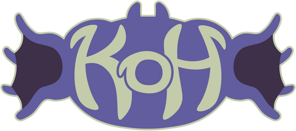
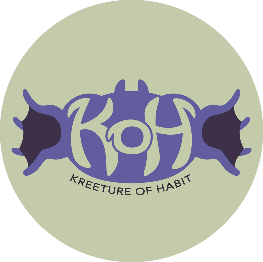
Kreeture

It all began with a character: Kreeture.Creating original characters has always been a big part of my artistic identity. Each character is an extension of myself; I use them for self-expression and to help make sense of complex emotions.

primary logo

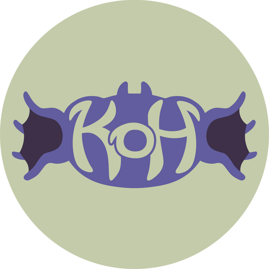
Kreeture (in brand colors)

secondary logo

Coming soon!

business card design

sticker sheet design


Resume
Education
Bachelor of Arts in Graphic Design and Media Arts
Southern New Hampshire University, Manchester, NH
June 2022 - June 2023
Courses of study included: Media Communication and Visual Literacy, Introduction to Digital Imaging, Graphics and Layout Print Media, History of Design, Desktop Publishing, Digital Graphic Design for Web, Digital Photography, Advanced Digital Graphic Design for Web, Typography, Advanced Digital Imaging, Graphic Design Portfolio
Bachelor of Fine Arts in Animation
Savannah College of Art and Design, Savannah, GA
September 2017 - May 2021
Courses of study included: Art History, Drawing, 2D Design, 3D Design, Color Theory, Action Analysis, 2D Animation,
3D Animation, Advanced Survey of Computer Applications, 3D Modeling and Lighting, 3D Character Rigging and Animation, 20th Century Art, Animation History, Story and Concept Development, Scripting, 3D Production Pipeline, Facial Rigging and Animation, Media Literacy Theory, Professional Practices, Speaking of Ideas, Non-Human Rigging, Animation Capstone Film
Skills
Software
Autodesk Maya, Adobe Photoshop, Adobe Illustrator, Adobe InDesign, Adobe Premiere Pro, Adobe After Effects, Adobe Acrobat, Adobe Lightroom Classic, Visual Studio Code, Procreate, Microsoft Office
Technical
Graphic Design, Layout Design, Brand Design, Logo Design, Print Design, Typography, Coding, HTML, CSS, Web Development, Photo Editing, Character Modeling, Prop Modeling, Environment Modeling, UV Unwrapping, Re-topologizing, Texturing, Lighting, Blendshapes, Concept Development, Story Development, Character Design, Video Editing, Sound Editing, Drawing, Storyboarding, 3D Animation, 2D Animation, Stop-Motion Set Fabrication
Professional
Creativity, Producing, Leadership, Team-building, Collaboration, Adaptability, Willingness to learn, Remote working, File management, Organization, Multitasking, Constructive criticism, Communication, Problem-solving, Researching, Task-scheduling, Empathetic listening, Reliability, Attention to detail, Diligence, Time-management
Work Experience
Lab Technician
The Goodyear Tire and Rubber Company, Danville, VA
April 2022 - June 2022
• Sorted through canisters of product samples and conducted tests to ensure the quality of the material
• Operated up to 12 laboratory machines and computers simultaneously, analyzing changes in data
• Located batches of material throughout the factory floor and approved them for manufacturing
Part-Time Sales Associate
Food Lion, Danville, VA
March 2022 - April 2022
• Operated cash registers and bagged groceries, sorting them quickly based on category, size, and weight
• Gathered shopping carts from the parking lot, returning them to the store entrance within an allotted time
• Attended to the needs of customers, answering their questions and retrieving merchandise as needed
Part-Time Sales Associate
Journeys, Danville, VA
November 2021 - April 2022
• Created a welcoming environment for customers, retrieving merchandise from the stockroom as requested
• Operated cash registers and gathered customer information, creating a convenient checkout process
• Maintained a clean and organized environment throughout the storefront and stockroom
Project Experience
TOWN
October 2022 - December 2022
• Developed a brand package made up of 3 print designs and a website built with HTML and CSS
• Edited images using Photoshop tools, ensuring versatility when applying them across different design pieces
• Conducted research on authentic Chinese cuisine in order to increase the accuracy of the project
• Initiated discussions with fellow designers, analyzing each other’s work and offering constructive criticism
Upper Crust Bakery
August 2022 - October 2022
• Developed a brand-redesign campaign from concept to completion, including a new logo and stationery set
• Conducted extensive research on bakery products and French pastries to ensure the accuracy of the designs
• Utilized tools within Adobe Photoshop and Adobe Illustrator to create layouts and edit images
• Discussed project progress with fellow designers, sharing ideas and offering advice on how to improve
Amethyst Bay Resort and Spa
June 2022 - August 2022
• Designed a 2-part advertising campaign, including a magazine ad and a web banner ad
• Conducted extensive research on Caribbean plants and animals throughout the course of the project
• Adhered to brand guidelines to ensure proper representation of the company and its values
• Utilized tools within Adobe Photoshop to edit 13 photos and create a GIF with transitional animations
The Softest Blanket in All of Dingledorf
Directed by Xan Poulsen
May 2020 - May 2021
• Created 90% of the 3D models for the film, including 6 characters, a castle interior, and various props
• Collaborated with the production team on concept development, story, texture design, and lighting
• Oversaw the rendering of numerous sequences within the film, keeping track of progress via spreadsheet
• Coordinated with the stop-motion team to design and fabricate set pieces, including a 3 ft tall rigged prop
Brake
Directed by Aja Weary
May 2020 - May 2021
• Created the 3D model of the main character, communicating with the director throughout the process
• Collaborated with rigging artists to build a quadruped rig and model blendshapes for facial animation
• Convened with the production team on a weekly basis to discuss film progress and plan tasks for the week
• Optimized the topology of character models, ensuring clean deformations and texture applications
Resume PDF
Portfolio
Graphic Design
Amethyst Bay Resort & Spa
Lil' Guppies Scuba School
Magazine Cover Swap
Upper Crust Bakery
Paws & Claws Animal Clinic
All Stars Sporting Goods
TOWN
3D Modeling
Cast of The Softest Blanket
Linx
Amethyst Bay
Resort and Spa


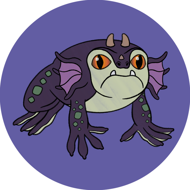
The Amethyst Bay project is a two-part advertising campaign I created for a fictional Caribbean resort. I developed it as an assignment for one of my university courses. When conceptualizing the direction I wanted to take with this project, I tried to put myself in the place of the audience. What would pull me in as a potential customer?Personally, I'm not very good at genuinely relaxing. I always need something to do, something to watch, or something to listen to. On top of that, I am very interested in animals and nature, so I decided to focus the campaign on activities involving the flora and fauna of the Caribbean. I gathered images of animals and plants that are native to the area, portraying them as though they were looking out at the viewer and inviting them to the resort.I also decided to use hexagons as the repeating shape throughout my designs. I felt as though they tied in nicely with the company's logo, seeing as hexagons are reminiscent of cut gems. They also give the composition a more unique, unusual feel than squares and circles would create, highlighting the exotic sights the Caribbean has to offer. I used the hexagons to frame my chosen images, treating them like windows, or more specifically, like portholes on a ship through which the subjects are looking out toward the viewer.With the web banner, I appreciated the challenge of having a limited canvas on which to condense my design. To make the most of the space, I decided to focus on my tagline, having the design center around the word "locals." I wanted this word to tell a story by itself, so I designed it to look like each letter had been cut out of a photograph. The colors and textures come from tropical flowers, reptiles, and birds, representing the variety that can be found in the Caribbean. My goal was to portray the flora and fauna as part of the community. I wanted them to seem like potential friends that the audience could interact with during their stay at the resort.
Photo Credits
Iguana
Scarlet Ibis
Frangipani Flowers
Waterlily
Toucan
Frog
Lizard Scales
Macaw Feathers
Flamingo Feathers
Plumeria Flowers
Green Iguana
Toad Skin
Tropical Leaves
@caglar via Adobe Stock
@vrabelpeter1 via Adobe Stock
@elpo11o via Adobe Stock
@Peter via Adobe Stock
@Kenneth Vargas via Adobe Stock
@Milan Zygmunt via Shutterstock
@Chaikom via Shutterstock
@Super Prin via Shutterstock
@Valeriya Zankovych via Shutterstock
@Jannarong via Shutterstock
@kurit afshen via Shutterstock
@Butterfly Hunter via Shutterstock
@EAKARAT BUANOI via Shutterstock
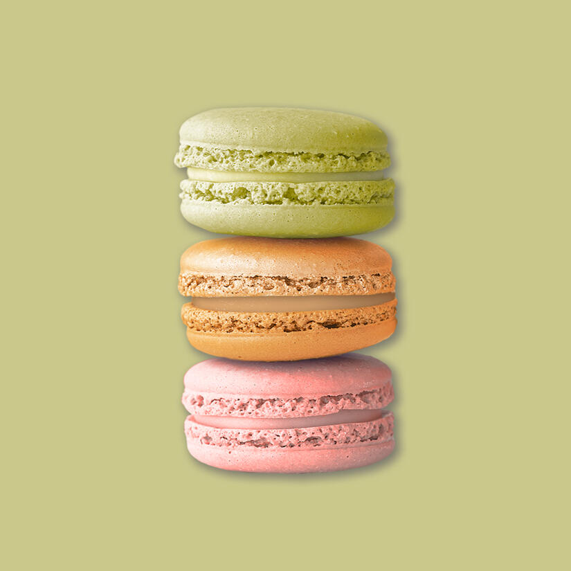
Upper Crust
Bakery

The Upper Crust Bakery project is a branding package I designed for a fictional company. It began as an assignment for one of my university courses, but I continued developing it even after the class ended. One of the main points listed in the client brief was the bakery's French origins, so I took inspiration from the quintessential, and most delicious, French pastry: the macaron.Macarons are one of the most recognizable French treats, and they take a lot of skill to make. Therefore, I knew that they would make a great symbol for a bakery with strong history to back up its craft. I chose the color palette based on the flavors that first come to my mind when I think of macarons. This trio of hues also has a springtime aesthetic, symbolizing the rebirth and rebranding of the company. It also gives the brand a welcoming, feminine personality.


After finalizing the logo, I also designed a business card, letterhead, envelope, and menu screens to match. Regarding the stationery, I decided to keep it simple and focus on using color as my main design tool. With the business card and envelope in particular, I wanted three different versions for the three main colors in the logo. This was a simple way to give the brand more variety. I used the same idea with the menu screens, but I also incorporated a pattern that I created from the logo for an added bit of flair.


Throughout the development of this project, I kept thinking back to my time attending college in Savannah. While living there, I bought macarons from a few pastry shops on and around Broughton Street. I imagined that if Upper Crust Bakery were a real business, it would fit right in with the downtown area. Drawing connections to my real-life experiences made my designs even stronger, as I was able to infuse them with a piece of myself.
Photo Credits
Bagels
Banana Bread
Croissant
Macaron Stack
Painted Wall
Sourdough Bread
Whole Wheat Bread
@Katie Mierau via Unsplash
@Wouter Supardi Salari via Unsplash
@Jocelyn Morales via Unsplash
@Heather Barnes via Unsplash
@Lorenzo Cafaro via Pixabay
@Tommaso Urli via Unsplash
@Sergio Arze via Unsplash
Mockup Credits
Business Cards
All Stars
Sporting Goods

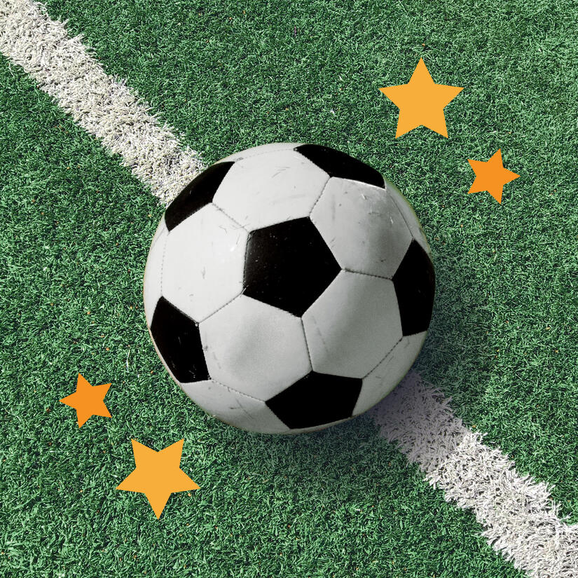
The All Stars Sporting Goods project is a brand redesign I created as extracurricular practice for a graphic design course. Although I chose a different client for my main project, I decided to create designs for all the other options as well to give myself more opportunities to exercise my skills.Whenever I think about sports, I think about college teams, and this is what drove my design. My goal was to create something that reminded the viewer of a football or baseball jersey. I chose fonts that had an academic, masculine feel to them and scaled up the “All Stars” part of the name so the logo would look bold and confident.Regarding the logo’s icon, I used a soccer ball (or a football for my non-Americans) because it is widely recognized across cultures. To tie into the stars and space theme, I turned the soccer ball into a Saturn-like planet with colorful rings. The colors give the logo a fun, energized pop, and break up the rigidity of the thick, masculine text. The icon and typography come together to create an all-welcoming, team-like feel. At All Stars, anyone can be a star.


After finalizing the logo, I designed a stationery set to match. I wanted to maintain a healthy amount of negative space, so I decided to use the colored rings from the icon as the element tying everything together. Since the company is fictional, the contact information on the stationery is fictional as well, but I had fun keeping it on theme with the project. (I honestly thought using the word “Cleat” as a first name was a stroke of genius and had a good laugh.)


I was trying to think of something I could add to this project, and then it hit me. Just like a sports team, sporting goods stores also have branded merch. So, I put together some mockups of what the All Stars apparel line would look like. For the colorful items, I decided to use the secondary logo, while I used the primary logo on the neutral items. It looks better this way and makes more sense design-wise.
Photo Credits
Green Turf
Guy Wearing Hoodie
Soccer Ball
@josiahday via Unsplash
@Vectonauta via Vecteezy
@Wesley Tingey via Unsplash
Mockup Credits
Baseball Cap
Business Card
Letterhead
T-Shirt
Water Bottle
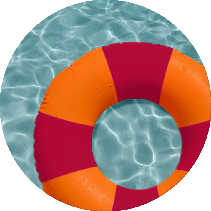
Lil' Guppies
Scuba School

The Lil' Guppies Scuba School project is a brand redesign I created as extracurricular practice for a graphic design course. Although I chose a different client for my main project, I decided to create designs for all the other options as well to give myself more opportunities to exercise my skills.The company's target audience is children and their parents or guardians. When I think about brands oriented toward children, I think about bright colors and cute characters with big, inviting eyes. After conceptualizing a few designs with various aquatic creatures, I decided to use a friendly-looking fish. I have the fish floating in an innertube to further push the theme of water safety.


Although the brand is oriented toward children, the stationery is more likely to be handled by adults, so I wanted the design to be more sophisticated. I took inspiration from the colorful tiles that can be found lining the inside and outside of swimming pools. By alternating the opacity of the squares, I created a gradient effect that mimics the way light shines on the water.(I limited the design the most on the envelope, as I wanted ample negative space for a forwarding address and postage.)
Photo Credits
Innertube
Pool Water
Poolside
@Jubéo Hernandez via Unsplash
@Anna Sullivan via Unsplash
@Thom Milkovic via Unsplash
Mockup Credits
Business Card
Letterhead
Paws and Claws
Holistic Animal Clinic

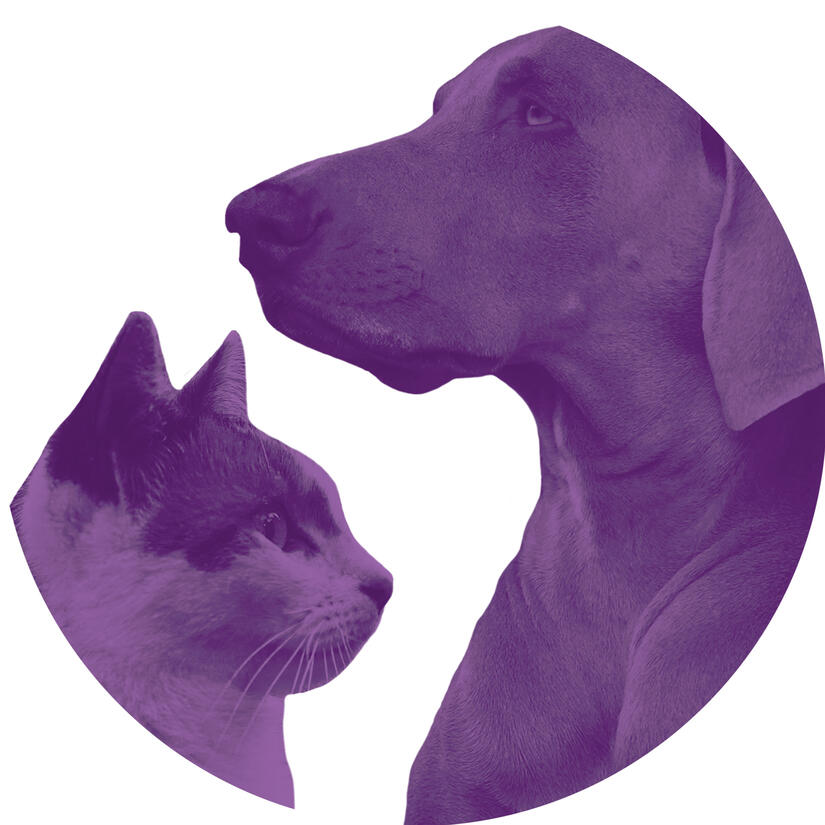
The Paws and Claws project is a brand redesign I created as extracurricular work for a graphic design course. Although I had chosen a different client for my main project, I decided to create designs for all the other options to give myself more opportunities to exercise my skills.The client brief explained that the company wanted to heighten the appeal to its main audience, that being upper to middle-class adults who like to go the extra mile for their pets. As the name suggests, the clinic specializes in natural and alternative remedies, so my immediate thought was to incorporate Eastern philosophies of health and wellness.The logo’s icon was inspired by the Chinese philosophy of yin and yang. I designed it after the famous symbol, replacing the two halves with abstract representations of a cat and a dog. As is well known, the philosophy describes the presence of two forces that are opposite, yet intrinsically linked. It centers around balance and harmony, so I felt that it was fitting to represent what the company stood for.


After finalizing the logo, I used it to inform the design of a stationery set. Seeing it is a clinic, I wanted to have plenty of negative space to make the stationery seem sophisticated and clean. To tie everything together, I used the purple from the logo and used it to create curves that referred back to the curves of the icon. Since the company is fictional, the contact information on the stationery is fictional as well, but I decided to keep it on theme to solidify the design.


I wanted to add something extra to this project as well, and after some brainstorming, I had an idea to conceptualize a line of pet products. I've been inside vet offices that also sell pet food and other items, and I imagined Paws and Claws would do the same.
Photo Credits
Blueberries
Cat
Dog
Oatmeal
@Bibhash Banerjee via Unsplash
@Uriel Soberanes via Unsplash
@Nathalie SPEHNER via Unsplash
@Jocelyn Morales via Unsplash
Mockup Credits
Business Card
Letterhead
Paw Pad Cream
Shampoo & Conditioner
Vitamin Supplement
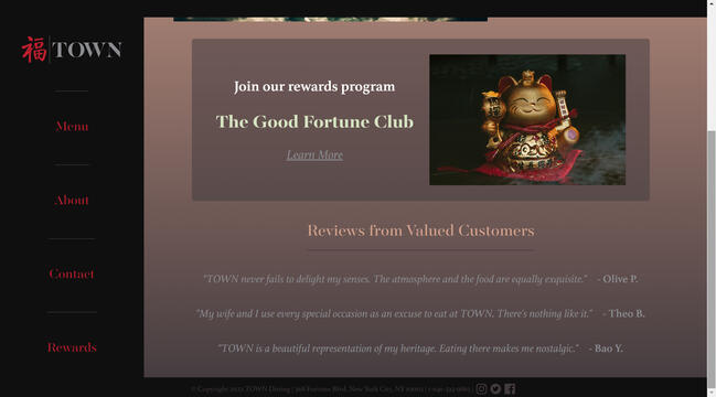
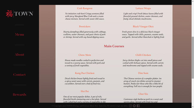
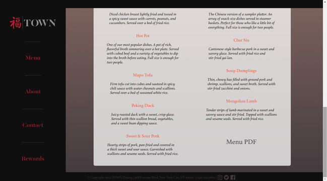
TOWN
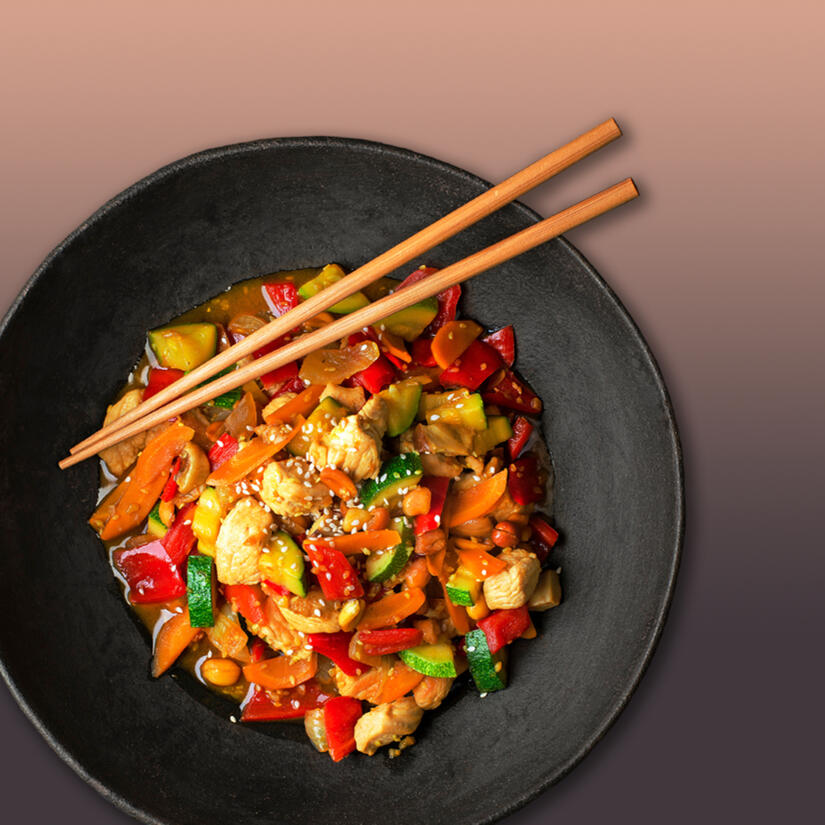
The TOWN project is a multi-part design campaign I created for a fictional luxury Chinese restaurant. I developed it as an assignment for two concurrent university courses. I designed three pieces intended for print, those being a table tent, a menu, and a tri-fold brochure, as well as built a website for the company in HTML and CSS.Throughout the development of this project, I took inspiration from a place called Arigato, a Japanese restaurant that my family and I have eaten at dozens of times throughout my life. TOWN is all about the dining experience, and at Arigato, they cook the food in front of you, so I drew a lot of similarities between the two businesses. I kept that thought in the back of my mind, trying to create designs that reminded me of how it felt whenever my family and I dined at Arigato. It's a place I associate with special occasions and celebrations, a place infused with great memories. Using a real-life example that's so familiar to me as a reference helped make my designs stronger.


It all started with the table tent. My first step was to figure out what its content would be. The choices were virtually limitless, so I created a limit myself. What would a luxury restaurant be advertising? According to the client brief, the company focused on creating experiential dining for its customers. Dining out that wasn't just dining out, but an experience that delighted the senses. I decided to focus the design on that sentiment. I put myself in the mind of the customer, thinking that if they loved the experience enough, they would tell their friends and family about it. They might even come back to the restaurant with their friends or family.After I decided on the content, I then moved on to the design of the table tent. Although these pieces were created in InDesign, I started off by experimenting in Illustrator. I had an idea of what I wanted to create. I knew I would have an image sandwiched between two shapes of flat color, and I wanted something I could use to soften the transition between elements. I played around with all the different stroke options in Illustrator, and it was out of this experimentation that I created the paintbrush-esque wave featured in my final pieces. I chose this design because I felt it tied into the theme of Chinese culture in a sophisticated way.The next part of the project was creating the menu, which gave me a wonderful opportunity to research Chinese cuisine. I implemented the brush-stroke wave design from the table tent, this time stretching it to better fit the dimensions of the menu. Although I kept the same brown color around the edges of the menu, I decided to make the center white to ensure readability. I then created visual hierarchy within the text using colors and fonts. For the headings, I used the same red as in the logo, as well as the same font, Majesti-Banner. For the menu item names, I used a red-orange that was listed in the brand guide and a second font, Athelas. I made the descriptions black and also in Athelas, and finally made the prices the same silver as in the logo. I wanted the prices to be as close in hue to the white background so that they were the last thing to be read by the viewer. I used images sparingly to keep the menu looking clean and confident.I then used the menu design to inform the design of the tri-fold brochure. My formula for laying out the brochure was mostly the same, and used the cover page of the brochure as a reference back to the table tent design. I also added some new sections that didn't fit onto the menu and created a special area for tea with a brand new color scheme. I wanted this section to stand out from the rest of the menu to emphasize that this is something unique that can only be found at TOWN. I used images sparingly here as well, carefully positioning them so they complemented the elements around them and helped to fill in some of the white space.

Home Page Part 1
Home Page Part 2

Menu Page Part 1
Menu Page Part 2
Menu Page Part 3

About Page
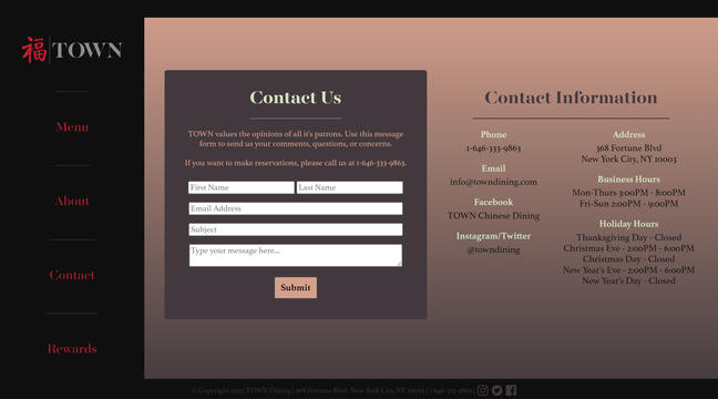
Contact Page

Rewards Page


At the same time I was developing the print designs, I was also developing a website for the company. The first step I took in this process was creating mock-up layouts in Illustrator. I had three ideas, the first two of which were more traditional in terms of the arrangement of elements. However, on my third mock-up, I decided to try something out of the box. Although I was just experimenting, to my surprise, I liked this unconventional design the best, so that was the one I worked with.That layout, of course, features the navigation menu on the left side of the page. In the middle of putting the initial mock-up together, it started reminding me of a shadow puppet stage. Shadow puppet shows are a part of Chinese history and culture, so I thought this layout could be another subtle reference to the restaurant's origins. I also thought this layout would make the website stand out from most of the other ones out there.I chose to use a gradient for the website background because it made me think of a dimly-lit restaurant dining room, which is exactly the kind of atmosphere I imagine TOWN having. It gives the design a sophisticated moodiness and an air of mystery, much like when you first walk into a new restaurant and have no idea what to expect. The only part of the website that I gave a white background was the menu, which I did to make it as readable as possible. I also added a link to a PDF version, which is the same one featured above in the print designs.
Photo Credits
Beef & Noodle Bowl
Lion Statue
Lucky Cat
Moon Cake
Smoky Kitchen
Spring Rolls
Steamer Baskets
Tea Tray
Rice Noodle Bowl
Vegetable Bowl
@nerudol via Adobe Stock
@leungchopan via Adobe Stock
@Наталья Маяк via Adobe Stock
@inspectordraco via Unsplash
@U2M Brand via Adobe Stock
@Voy_ager via Adobe Stock
@uckyo via Adobe Stock
@aligrapher via Unsplash
@zakiroff via Adobe Stock
@Dušan Zidar via Adobe Stock
Mockup Credits
Menu
Table Tent
Tri-fold Brochure
Sound Credits
Chinese Lo-Fi Hip Hop
@RoyaltyFreeMusic via Pixabay
Magazine Cover Swap
Coming soon!


Coming soon!
Get in touch!
My
Other Sites
Kreeture_19
Etsy Shop